
Wall Decor Ideas for Men: Style Your Space with Ease
Key Takeaways
- Learn the core rules (height, spacing, scale, and balance) that make any arrangement look cohesive and intentional;
- Discover wall art arrangement ideas for living rooms, bedrooms, hallways, staircases, and awkward walls that you can copy with confidence;
- Use simple spacing and sizing cheat sheets to arrange grids, gallery walls, and over‑furniture layouts the right way, the first time;
- Create, stick, and re‑stick your wall with Mixtiles’ lightweight photo tiles and gallery wall kits. No nails, no damage, total flexibility.
Looking for wall art arrangement ideas that work in real homes and not just showrooms? This guide gives you the exact height, spacing, and scale rules, plus copy-ready layouts for every room. You will learn how to hang a single statement piece, build a balanced gallery wall, or set up a precise grid. With Mixtiles adhesive and magnetic tiles, you can create a wall with your photos, then move pieces around anytime without damaging the wall.
Ready to design your wall in minutes? Create a stunning photo gallery wall with Mixtiles. Our adhesive tiles are lightweight and damage-free, letting you preview your layout before you order.
What basic rules make any wall art arrangement look polished?
The best results come from a few simple principles: hang at eye level, keep consistent spacing between frames, scale art to the furniture below, and repeat a few finishes or colors to feel cohesive. Use these as your first guide, then adjust to the space and your style.
What height should I hang art?
Aim to center a single piece or a grouped collection at about 57 inches, 145 cm, from the floor. Treat a group of art as one unit and place the visual center at eye level. If you are tall or the ceilings are high, you can inch up slightly, but keep the center line consistent from room to room for a calm look. For room-by-room nuances and common mistakes to avoid, see our guide on how high to hang art on a wall.
How much space should I leave between frames?
For most arrangements, 2 to 3 inches (5 to 8 cm), between frames looks balanced. If frames are large or the wall is expansive, 3 to 4 inches (8 to 10 cm), can add breathing room. Keep the gaps the same across the wall and the look will feel professional.
What about scale over furniture?
Over a sofa, bed, or console, fill roughly two thirds to three quarters of the furniture width. Leave about 6 to 8 inches (15 to 20 cm) between the top of the furniture and the bottom of the art. That spacing keeps the art connected to the furniture and prevents a floating look. If you are unsure about proportions for different furniture sizes, reference our wall art size guide for exact measurements and visual examples.
How do I keep the look cohesive?
Limit frame finishes to one or two, for example black and white, or natural wood and black. Use a simple color strategy. You can group photos by palette or theme, like a collection of your travel photos, to create unity across different sizes.
Any renter-friendly planning hacks?
Lay everything out on the floor first, then transfer to your wall and tweak in place. Mixtiles picture tiles stick and re-stick, so you can adjust spacing with your eye until the arrangement feels right. No nails. No holes. No stress.
Which wall art arrangement ideas work best over a sofa or bed?
Over large furniture, you can choose a single focal point, a pair, a trio, a tidy grid, or a picture ledge setup. The best layout depends on the wall width and the style you want. Use the quick ideas below to match your room and your photos.
Single statement piece
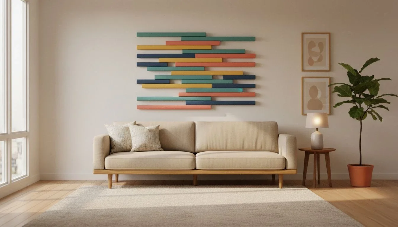
A single large piece creates an instant focal point in a living room or above a bed. Aim for a width that is about 50 to 75 percent of the furniture width. A big canvas print or a collage of Mixtiles can anchor the wall and set the tone for the decor around it.
Pairs, diptych
Two equal pieces in matching frames look clean and modern. Hang horizontally to stretch over a sofa, or vertically to fit a tall headboard. Use photos with the same mood or colors so the pair reads as one idea.
Trios, triptych or mixed trio
Three pieces add rhythm. Try three equal frames in a row for symmetry, or one large frame flanked by two smaller frames for depth. Keep the gaps consistent so the trio feels connected.
Simple grid
A 2 by 2 or 3 by 2 grid is a straightforward way to arrange multiple photos. The repeating structure keeps the wall calm even when the images are different. This works well when you want many memories on your wall and an orderly look.
Picture ledge combo
Rest frames on a narrow ledge above the sofa or bed. Layer sizes, mix black and white frames, and swap photos anytime. Mixtiles tiles are lightweight, so even larger sizes feel safe and easy to handle on a shelf.
Recommended artwork width over furniture
Use the table below to choose a total artwork width that fits your furniture and to find example Mixtiles layouts that meet the size target.
|
Furniture Width |
Furniture Width, cm |
Recommended Total Artwork Width |
Recommended Width, cm |
Example Layouts, Mixtiles |
|---|---|---|---|---|
|
60–72 in |
152–183 cm |
40–54 in, 2/3–3/4 |
102–137 cm |
Three 12 × 16, hung horizontally; one 27 × 36 canvas; |
|
72–84 in |
183–213 cm |
48–63 in |
122–160 cm |
2 × 20 × 27 side by side; 3 × 12 × 12 in a row; 2 × 12 × 16 + 1 × 12 × 12; |
|
84–96 in |
213–244 cm |
56–72 in |
142–183 cm |
3 × 12 × 16 over a sofa; 2 × 27 × 20 with small spacer; 2 × 20 × 20 + 1 × 12 × 16 center. |
How do you build a gallery wall that looks curated, not cluttered?
Choose an anchor piece, balance the layout with pairs, then fill gaps with smaller frames while keeping spacing even. Repeat a frame color or mat to tie the collection together and keep the look cohesive. For more step-by-step layouts and printable spacing templates, explore our guide on how to arrange art on a wall.
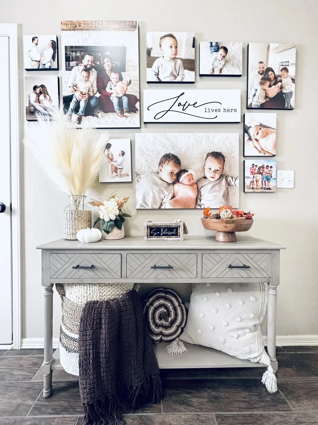
What is an organic, salon-style gallery wall?

It is a collection of different sizes and orientations arranged around a central anchor. Start with the largest piece slightly off center, then add frames around it. Let the edges step up and down so the wall has movement and depth.
How do I create a symmetrical gallery wall?

Mirror the left and right sides. Use the same sizes or a repeating pattern, for example two large frames in the middle with matching medium frames flanking them. The symmetry creates an elegant, collected look in a dining room or living room.
What is a foolproof planning process?

Gather all pieces on the floor first. Place the anchor piece. Add a pair on one side and echo the size or shape on the other side. Fill the gaps with small frames that connect everything. Keep the outer silhouette tidy, and the composition will read as one piece of art.
Spacing cheat sheet for gallery walls:
- Small frames: 2 inches (5 cm) between edges;
- Medium frames: 2.5 inches (6 to 7 cm) between edges;
- Large frames: 3 inches (8 cm) between edges.
Can a tidy grid make a big impact? Which grid layouts should I copy?
Yes. Grids bring order to a wall with many photos. Choose a 2 by 2, a 3 by 3, a 2 by 4, or a 3 by 2, then keep the gaps and margins uniform. The result is modern, calm, and easy to scale up over time.
2 by 2 square grid

Four equal frames create a compact focal point. Try 12 × 12 tiles above a console for a simple and striking arrangement.
3 by 3 square grid

Nine equal frames transform a blank wall into a square of art. This format works well behind a dining table or in a home office where you want impact without visual clutter.
2 by 4, or 4 by 2, rectangular grid

Eight equal frames fit long walls. Use the horizontal version in a hallway or the vertical version to fill a tall, narrow wall. Keep the center of the entire grid at eye level for balance.
3 by 2 over a sofa

Six equal frames span most sofas. When you want a gallery wall that looks highly organized, this is a reliable choice that is easy to hang with a level and a tape measure.
Grid measurements to nail the look:
- Gap between frames: 2 to 3 inches (5 to 8 cm);
- Outer margins: 4 to 6 inches (10 to 15 cm) from furniture or wall edges;
- Center line: about 57 inches (145 cm) from the floor.
What wall art arrangement ideas work best for narrow walls and hallways?
Think vertical, linear, and light. Stack frames, run a straight line of images, or create repeat mini galleries. Keep spacing tight and use consistent frames to make the corridor feel ordered rather than busy.
- Vertical stacks: Two or three frames stacked closely work well at the end of a hall or beside a door. Use matching frames and equal spacing to create a neat column of art.
- Linear run: Place evenly spaced frames in a single row along the wall. This approach keeps the line of travel clear and puts the art at the right eye height.
- Mini galleries at intervals: Repeat small clusters of three or four frames along a long hallway. Each cluster becomes a pause point. Use the same frame color for all clusters to keep the whole space cohesive.
- Entryway vignette: Over a bench or console, hang one medium frame and one small frame together. The contrast in size adds energy without crowding the space.
How do you style art around a TV or fireplace without visual chaos?
Balance the weight of the TV or mantel with art that echoes the shape and scale. Treat the TV like a big black frame and compose around it. On a mantel, lean and layer to add depth without drilling into brick.
TV gallery wall
Build a gallery around the TV by placing medium frames on both sides. Use black frames to echo the TV, or use white frames for contrast. Keep the bottom edges of nearby frames aligned with the bottom of the TV for a quiet horizon line.
Mantel leaner
Lean one large piece of art on the mantel, then set a couple of smaller pieces in front to create depth. This layered look is flexible and easy to refresh with new photos over time.
Asymmetry that works
Offset a larger frame on one side of the TV or fireplace and balance it with two smaller frames on the other side. The different sizes feel intentional when the spacing is consistent.
What are clever ways to display small art and mini prints?
Use small pieces to add texture where large art would overwhelm the room. Mini grids, shelves, and desk vignettes let you show many memories without taking over the wall.
Mini grid
A 3 by 3 or 4 by 3 of 8x8 canvas prints looks crisp and modern. The repeated square size makes a collection of your best photos feel like one cohesive piece.
Shelf styling
On bookcases, lean small framed pieces between stacks of books and decorative objects. Group by color or theme so the shelf feels edited, not random.
Desk or nook gallery
Hang a tidy trio over a desk or vanity. This adds personality at eye height where you work or get ready. You can swap images seasonally to keep the space feeling new.
Design, stick, and re-stick. Our lightweight and renter-friendly photo tiles make it easy. Order from your phone, preview in our app, and move frames around to fine-tune spacing. If you are not sure how to begin, browse our gallery walls to get a pre-arranged layout you can customize.
How do you handle staircases and awkward walls?
Let the wall shape guide the arrangement. On stairs, follow the rise. In odd nooks, use symmetry or a compact grid to bring order. Keep clearances safe and spacing steady so the layout feels intentional. For more compositions that follow the rise and work on landings, browse our staircase wall decor ideas.
- Staircase flow: Run the center line of your frames parallel to the handrail. The diagonal rhythm leads the eye up the steps. Keep lower frames above the railing for safety and a clean look.
- Landing focal point: At a landing, hang one larger piece as a focal point. Add a pair of smaller pieces on one side for balance. This creates a moment of pause between floors.
- Nooks and odd angles: Use a tight 2 by 2 grid or a pair of matching frames to calm a tricky corner. Repeating the same size brings order when the walls are irregular.
Staircase quick tips:
- Keep the lower edge of frames above handrail height for safety;
- Maintain 2 to 3 inches, 5 to 8 cm, between frames along the diagonal;
- Use the stair angle as your guide so the composition rises with the steps.
How do you choose frame finishes, sizes, and colors that feel cohesive?
Repeat a few elements across the wall. Choose one or two frame colors, repeat a size at least twice, and use mats to unify different photos. This method works for black and white collections and for colorful family galleries alike.
Frames and mats
Pick one or two finishes. Black frames sharpen modern photos. White or light wood frames feel airy and Scandinavian. Printed mats add breathing room around photos and help different sizes live together on the same wall.
Color strategy
Decide on a dominant palette. You can go monochrome with black and white prints, choose two to three accent colors that repeat, or keep the collection neutral and let one bold piece be the focal point. The color plan keeps many pieces from feeling scattered.
Size guide you can rely on
Mix sizes with intention. Small tiles like 8 × 8 work well in grids or as connectors between larger pieces. Medium sizes like 12 × 12 and 12 × 16 build the backbone of a gallery wall. Large sizes like 20 × 27 or 27 × 36 create the anchor. Repeat at least one size to make the arrangement feel unified.
What makes Mixtiles the easiest way to test and perfect your layout?
Mixtiles are designed to help you get layouts right without tools. They stick and re-stick, so you can try the arrangement in real time and make small adjustments until it looks perfect at a glance.
No-commitment arranging
Place tiles on the wall, step back, and adjust. The adhesive is strong yet gentle, so you can move frames without damaging the surface. On rough walls, press for a few seconds to help the adhesive grip.
Fast from phone to wall
Upload photos from your camera roll, Google Photos, or iCloud, pick a framed, frameless, or canvas style, then preview the layout. Gallery Wall Kits give you curated templates if you want a head start.
Effortless updates
Add new photos over time, swap positions, or change the whole arrangement when your decor changes. For care, dust with a dry, soft cloth. There is no glass, so glare is minimal and cleaning is simple.
With the right fundamentals and a handful of wall art arrangement ideas, you can turn any blank wall into a balanced display of art and photos. Start with eye level, even spacing, and the right scale over furniture. Then choose a layout that matches the space, a clean grid, a symmetrical gallery wall, or an organic collection that grows with your home. Mixtiles helps you arrange, hang, and refine without nails or holes, so your wall is always easy to update.
Turn your favorite photos into stunning wall arts. Design your wall with Mixtiles today, and explore our beautiful custom canvas prints to find the perfect statement piece. Enjoy fast delivery, easy hanging, and endless rearranging.
Frequently Asked Questions
What is the best way to arrange wall art?
Begin at eye level. Center a single piece or the visual center of a group at about 57 inches, 145 cm, from the floor. Keep gaps even, typically 2 to 3 inches, 5 to 8 cm. Scale to furniture, about two thirds to three quarters its width. Repeat frame colors for cohesion.
What is the two-thirds rule for art over furniture?
Choose art that is roughly two thirds to three quarters the width of the furniture below. Leave 6 to 8 inches, 15 to 20 cm, between the top of the furniture and the bottom of the art. This proportion feels balanced and keeps the grouping visually connected.
What is the 57 inch rule for hanging art?
Center the artwork at about 57 inches, 145 cm, from the floor. This aligns with average eye level in galleries. If ceilings are high or it looks low, raise the center to 58 to 60 inches. Keep the center line consistent across rooms for a calm, unified look.
What wall art trends are popular right now?
Popular looks include curated gallery walls, precise grids, oversized single statements, nature and abstract photography, and neutral rooms with bold art accents. Mixing frames or frameless tiles adds texture. Renter friendly, adhesive photo tiles like Mixtiles make testing, hanging, and refreshing layouts fast and damage free.
Be the first to know — deals, news & decor ideas.
By clicking you agree to the Terms of Use & Privacy Policy